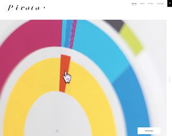
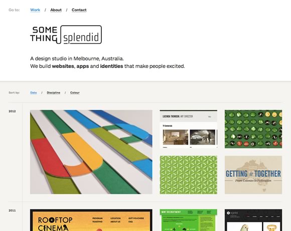
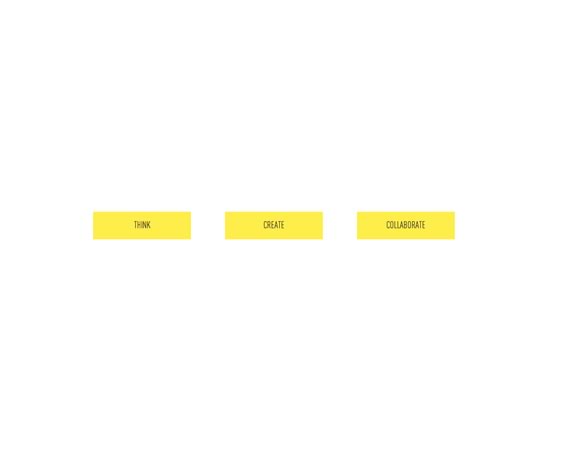
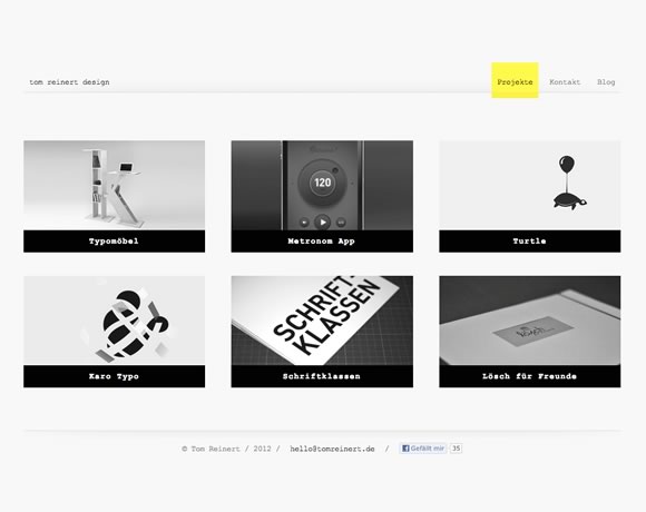
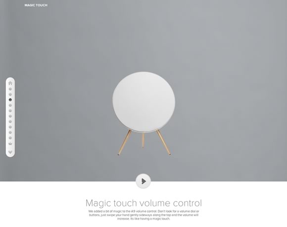
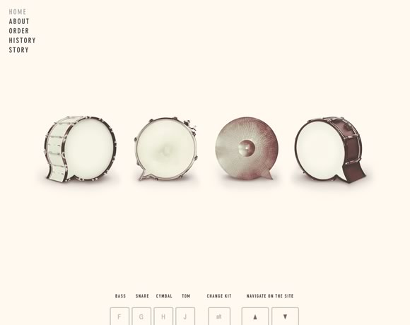
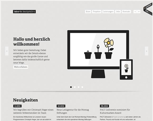
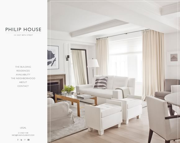
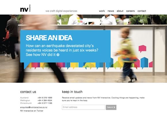
White space is the blank space, the empty space, between elements. It’s the space we leave between elements to give a layout an elegant look, a clean look. Lately we can see that more and more designers are realizing the importance of creating clean designs, designs that are user friendly and that take advantage of white space. From using white space in headers, footers, between menus, between images and information, texts and sidebars, here you will see great examples of whites space usage in web design. Remember that white space doesn’t need to be white, it may be any color, as long as it is empty.
Thursday, December 20, 2012
Subscribe to:
Post Comments (Atom)











0 comments:
Post a Comment